Kill Bill
Alternative Movie Poster
“Revenge is never a straight line. It’s a forest. And like a forest, it’s easy to lose your way...to get lost...to forget where you came in.”
That line doesn’t have a lot to do with my work on this poster, but it’s a badass, badass line. And it rings very true, although to be honest, being a mainly urban ape with a pretty coddled life all things considered, I have never engaged in any kind of real revenge, rectilinear or otherwise. I say we just believe the quote, and if anybody asks, it’s appropriate because the snake in the poster is not posed in a straight line. Or something.
Let’s get that out of the way: it took me a long time to come up with this idea. I played with a number of other approaches, mainly because there are a lot of different angles one can take when thinking about these movies, but also because I don’t really have a system for this. In case you hadn’t noticed it, I’m a bit of a hack.
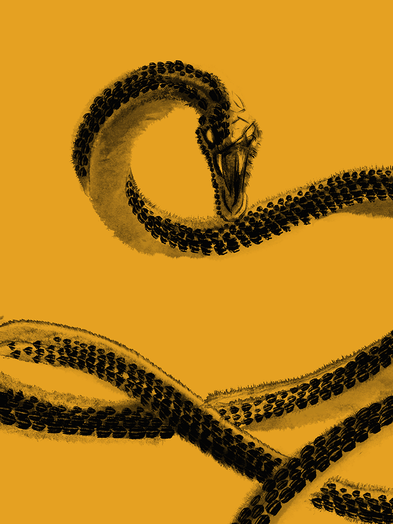
But anyway, as luck would have it, the hilt of Beatrix’s katana was an image that kept popping up in my mind, and trying to come up with interesting things to do with it, the idea of doing something with the wrapped silk thingie (the Ito, as I came to learn it’s called), seemed cool. Probably the fact that the hilts are usually covered with ray skin (this is called the Samé… What? let me gloat in the cursory and soon-to-be-forgotten knowledge I hurriedly looked for on the Internet, ok?), spiked some kind of free association and the idea of morphing the hilt into a snake (a Black Mamba, since Beatr—ok, ok, I’ll shit the fuck up already, sorry), came about.
Once that idea was clear, a sketch was made, and we were off to the races. The very long, frustrating races.
Because you see, it’s not only that the concept itself was hard to come up with. It’s that I decided to honour the Asian influences in the movie by doing the poster in a style that could be a shorthand for “cool, Asian-inspired art”. Yeah, I know. I’m a typical Westerner. Sorry.
But all jokes aside, I really wanted this to feel like something that could maybe have been painted on paper, with a brush and ink washes. But since there was no way I was gonna be able to hack that on my limited skills, I needed to find a way to do it digitally. Spoiler alert: it was not easy.
The problem was trying to balance the free-flowing, analog feeling, with a style that was detailed enough that you could understand the transition between the sword and the snake. And that’s fucking easier said than done. I must have redrawn those freaking scales 9 times, no joke.
However, the final result, even tho it hurt me a bit when I look at some parts of it, is decent enough to convey the message. All in all, the time, frustration, and the 7 million scales I had to paint and erase, were worth it.
Oh, crap, I almost finish without talking about the variants!
Thing is, I loved the final, yellow poster, but the idea of a red one seemed just so freaking cool… after all, there is a lot of red in the movies, lol. Also, I have always been a sucker for Japanese (or Greek, or Cyrillic, or fucking Tengwar) in posters so, you know, I had to make that happen too.
So that gave us the Red Sea Variant. And from there I was just one small jump to the Bloody Affair Variant, with all that glorious white and just a hint of blood. I really like that one; it’s simple, stark. And as a side note, I really, really like the idea of always having a variant that only uses Red, Black and White as colours. Let’s see if I can make that happen…
And that’s it… a lot of text that maybe doesn’t say a lot, but that I hope was at least interesting and/or amusing in some way. Here, look at some pictures, and just so this seems like it offers something extra, I’ll throw in the original sketch for the thing. Thanks for reading, guys.