Portraits - Kill Bill
Companion Prints
“"You And I Have Unfinished Business!"”
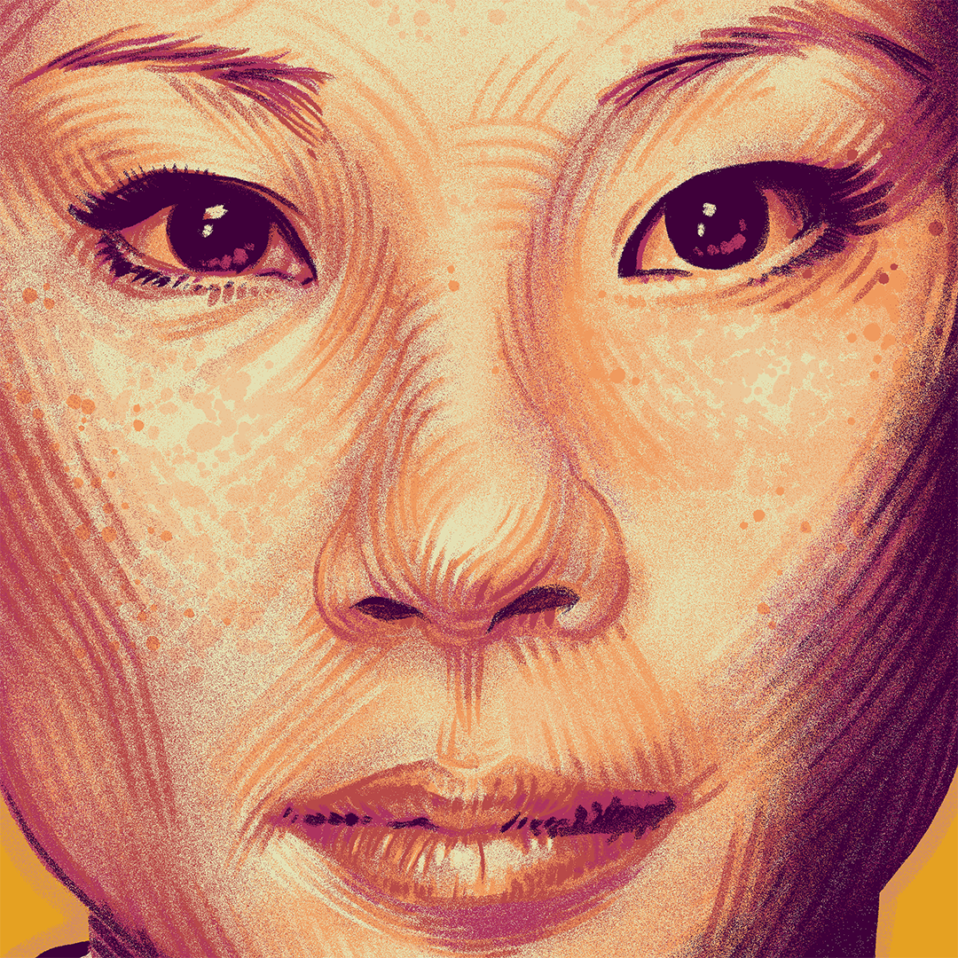
That is the way I felt about the O-Ren Ishii portrait I painted before. It was meant as an exploration and a technique test, and to gear up for my “real” work on Kill Bill, but I kept wanting to not only revisit it, but to expand upon it. And here we are.
Some of you may be aware that I’ve been working on a series of artifact prints to serve as companions to the alternative movie posters I paint. However, after a while, the idea of painting people instead of things started itching, and while I thought the ocasional sketch or style exploration would be enough, that was not the case.
So, for my work on Kill Bill I decided to eschew the usual artifacts and work instead on a set of portraits. And since I am not a savage and rules still apply, mind you, I decided to keep my usual square format, and the number of portraits should still be 3, as it was with the artifacts.
With that decided, the subjects for the portraits were easy enough to pick. I already had O-Ren, and while you might argue she’s not necessarily a super important character in the movie, I have a single counterargument: look at those freaking cheekbones! Case closed. Next.
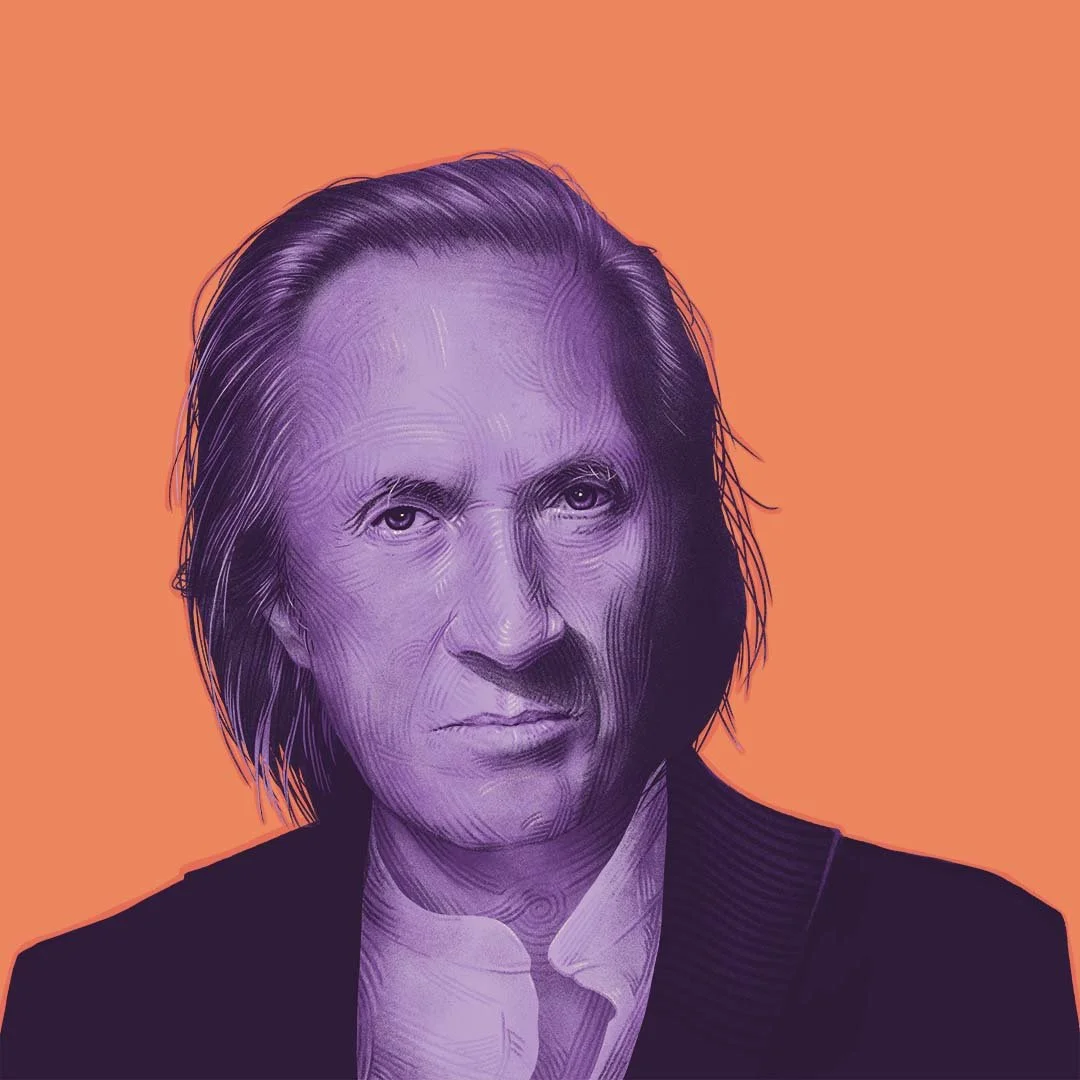
For the other two, I of course had to paint Bill and Beatrix, and to keep things consistent (and because I still have a lot of work to do to be able to feel comfortable painting likenesses), full frontal was the way to go. No, not that full frontal, pervs.
So, after that, it was a matter of noodling and doubting and painting and repainting, and seeing where this zen garden squiggly line thing is taking me… it was a lot of fun, and frustrating as all fuck at the same time. But in the end I arrived at three semi decent portraits, with semi decent likenesses, a semi decent style, and awfully disjointed colour schemes!
At that point I had not really locked in on a design or a palette for the AMP, so I just went with my gut, colour-wise. However, after the idea for the big poster was clear enough, I made a colour pass over these, and made their palette something that worked a bit better together, and more importantly, something that would look half decent alongside the big prints on a wall. Hopefully you’ll think something along those lines, lol.
I include here both the finished versions and the original colour schemes, just for kicks. See you around, and as always, thanks for reading.