Pulp Fiction
Alternative Movie Poster
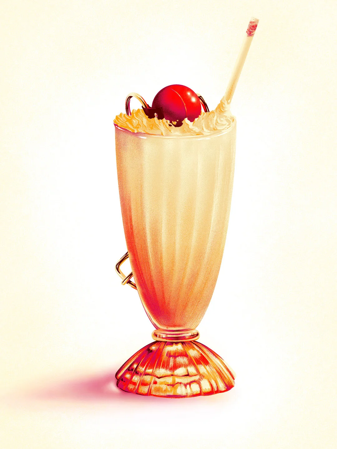
“That's a pretty fucking good milkshake. I don't know if it's worth five dollars but it's pretty fucking good”
I remember watching this film at the movies. Yeah, I’m that old, but we’re not talking about that today. We’re also not talking about how I laughed out loud when Vincent shot Marvin on the face and hence how I might be a terrible person.
What we’re gonna be talking about, is what a cool movie Pulp Fiction is, and how I tried to make it justice with what I hope is a fresh take on the property. Read on, Pumpkins and Honey Bunnies…
By now, I’m pretty sure you have seen a hundred different takes on Pulp Fiction posters (and there are so many beautiful ones among them), but I tried to go with a simple yet layered take on the themes from the movie. The lavish and the sordid. The sexy and the violently deranged. The sweet and the… I don’t know, the bitter? help me out here, I’m losing it.
… Anyway. I tried to do what comes naturally to me and also tried to sort of build on the type of concept that seems to resonate with people when it comes to my work. A simple composition, a somewhat detailed rendering, and an image that can be read in more than one way, or from more than one perspective.
I kept coming back to the idea of juxtaposition. And I realized the cherry on top of the milkshake (go back and watch the scene again. The lighting is amazing, very Tarantino, and it makes the cherry POP!) is a very bright spot of pure red the kind of which is almost never seen again in the movie until we see that ball gag, shiny with saliva, barely fitting in Marsellus’ and Butch’s mouths. I mean, after that, the poster basically designed itself.
With a clear idea, it was a matter of just getting some reference (love that I can justify my Google Search history as “hey, it’s for work!”), and just scribbling and noodling and scratching away. I went for warm tones to go with the vibe of the movie, and added just a smidge of purple in the shadows to balance the warmth. And because purple is pretty.
The hardest part by far was making sure that the milkshake read well enough from afar, with the red spot easily taken for a cherry, but at the same time making it clear that something was off, and you should come closer and look more intently and by the way, here’s a ball gag! Hopefully the discovery would elicit a bit of shock, and then a moment of putting 2 and 2 together, and then a slow “heeey, that’s cool, man!”. As you can see, I plan very carefully people’s reactions to my scribbles.
Thanks for reading all this. I fear it sounds terribly petulant/all over the place, and that might be an accurate representation of my life, but I hope it was a bit entertaining and that it gave a bit of perspective on what I was thinking while I made the thing. Here, look at some other pictures: